Design an experience for new students to browse, search, and propose new student organizations.
Before jumping straight into the user flow and mockups, I started with doing some research on club pages from the University of Waterloo, UCLA, and George Brown College. I chose a University from Canada, a University from USA, and a College from Canada to get a broad scope of how clubs were running in different environments. For all three sites, the task was to; search for a club of interest, join a club and start a club application (starting and joining a club was limited due to student logins/portals). This is what I noticed after 'stress' testing each site, within my capabilities.
Being my own university, I tried my best to ignore biases, as that would have impacted the user testing. From the general observations;
Main club, with sub groups
As noticed in every club fair and recruitment cycle, students (mostly first-years) are always amped to join a club. However, over the school year, participation and active counts start to die down, and rightfully so due to projects, quizzes, tests, and exams.
Being a past executive for a club called UW eSports and a member of UX/Product Club, many common statements made by club members and executives were;
1.I don’t find clubs and councils online, I like to go to the club fair to find them
2.Hard to promote an event. Everything clubs and councils do are by themselves, the club committees provide no help
3.I hear about clubs from friends, especially the wacky ones
After testing and researching other school sites, as well as having first-hand experience with running a club, these were the insights that I needed to address;

The progress from joining, starting, and searching needs to be streamlined.

The club fair's experience need to connect with the students outside the fair.

Clubs/councils need to be recognized more for their efforts.
Relating to the research and narrowing of the problem, I decided to better relations between club committees, clubs/councils, and the students
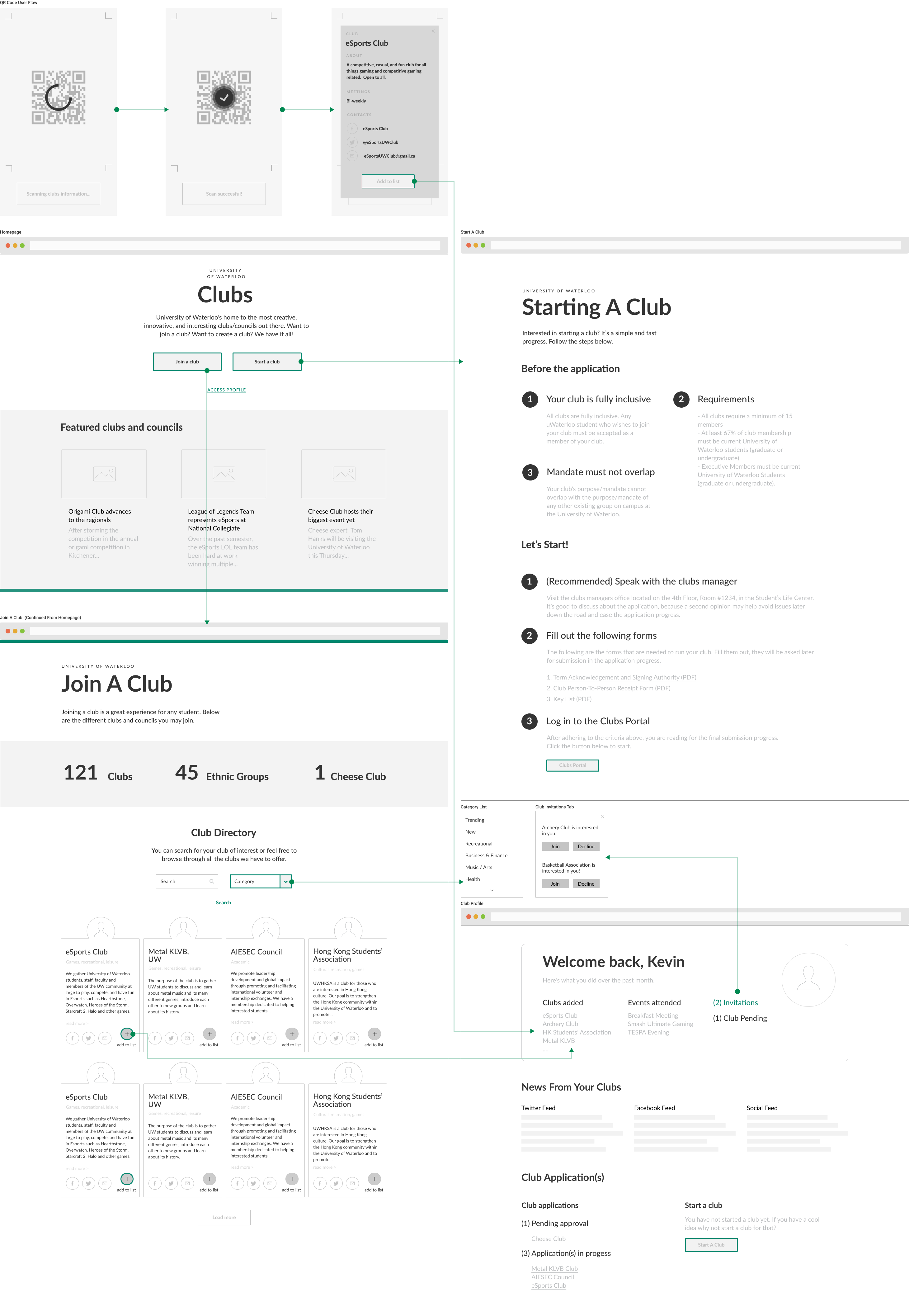
Taking the research gathered from the Heuristic Research and critical thinking from analyzing the problem at hand, I wanted to design 2 user flows surrounding both web and mobile. The reason why I wanted to design two user flows is because going to club fairs, and coming home from them both are critical points of interaction many students and club executives experience. Talking with club members is one thing, however, going home and acting on a club application or asking to join a club is another.
This was from last semesters club fair week. As you can see, there were alot of people interested in our club and other clubs in general. However, notice a problem? When asked how they could contact us, we had to point to our board showing them our contact info. Not only was it hard for them to see our info, but they were clogging up the space along the aisles for other clubs.
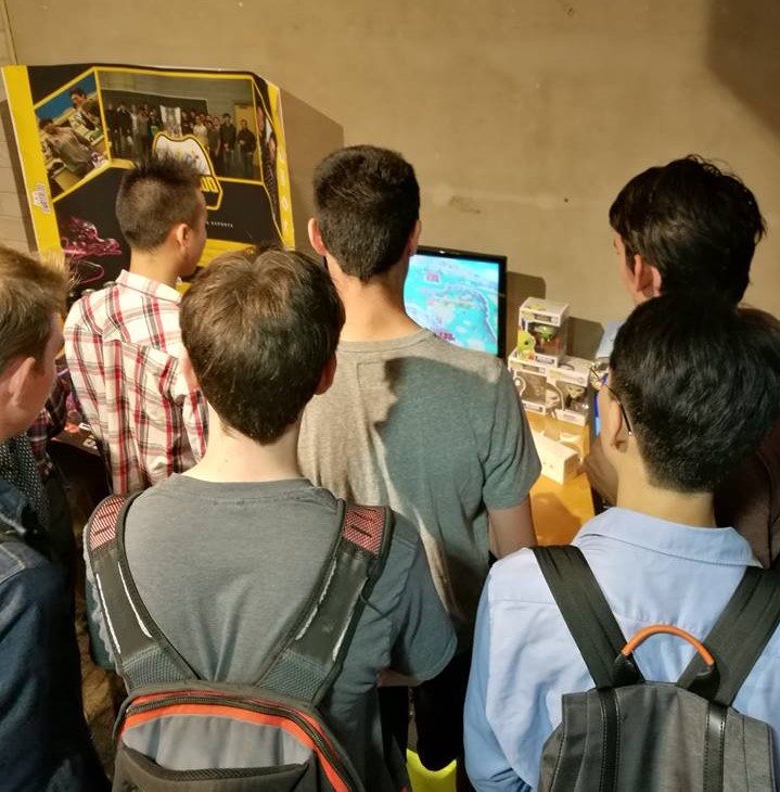
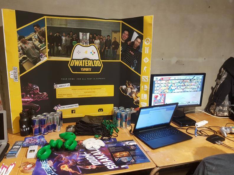
Contact info can hardly be seen
Why not generate a QR code for clubs that house all their contact information? That way when interested students need the contact information on club fair day, they can instantly scan the code to get all the info. Once the scan is successful, a quick dropdown section will allow the user to quickly see valuable information, and decide whether or not they want to add it their interests list.
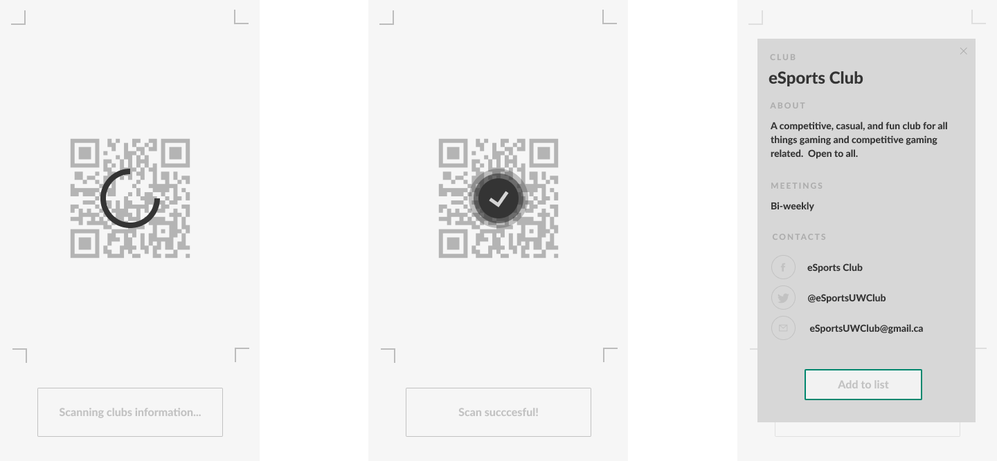
User flow for QR Scan
For the website, I centered my user flow around one main objective efficiency. At the start of the flow, users are greeted with the choice to either "Join A Club" or "Start A Club". This establishes an immediate response to why many students go on the website, to find clubs they are interested in or jump start a club. There is a featured section on the homepage for clubs/councils. This gives a greater motivation for clubs/councils to go above-and-beyond and get free publicity space, as this homepage would be viewed by thousands. This features section would rotate weekly giving other chances for club/councils to appear.
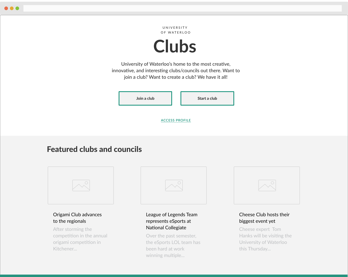
Green bar represents a continuation of the page
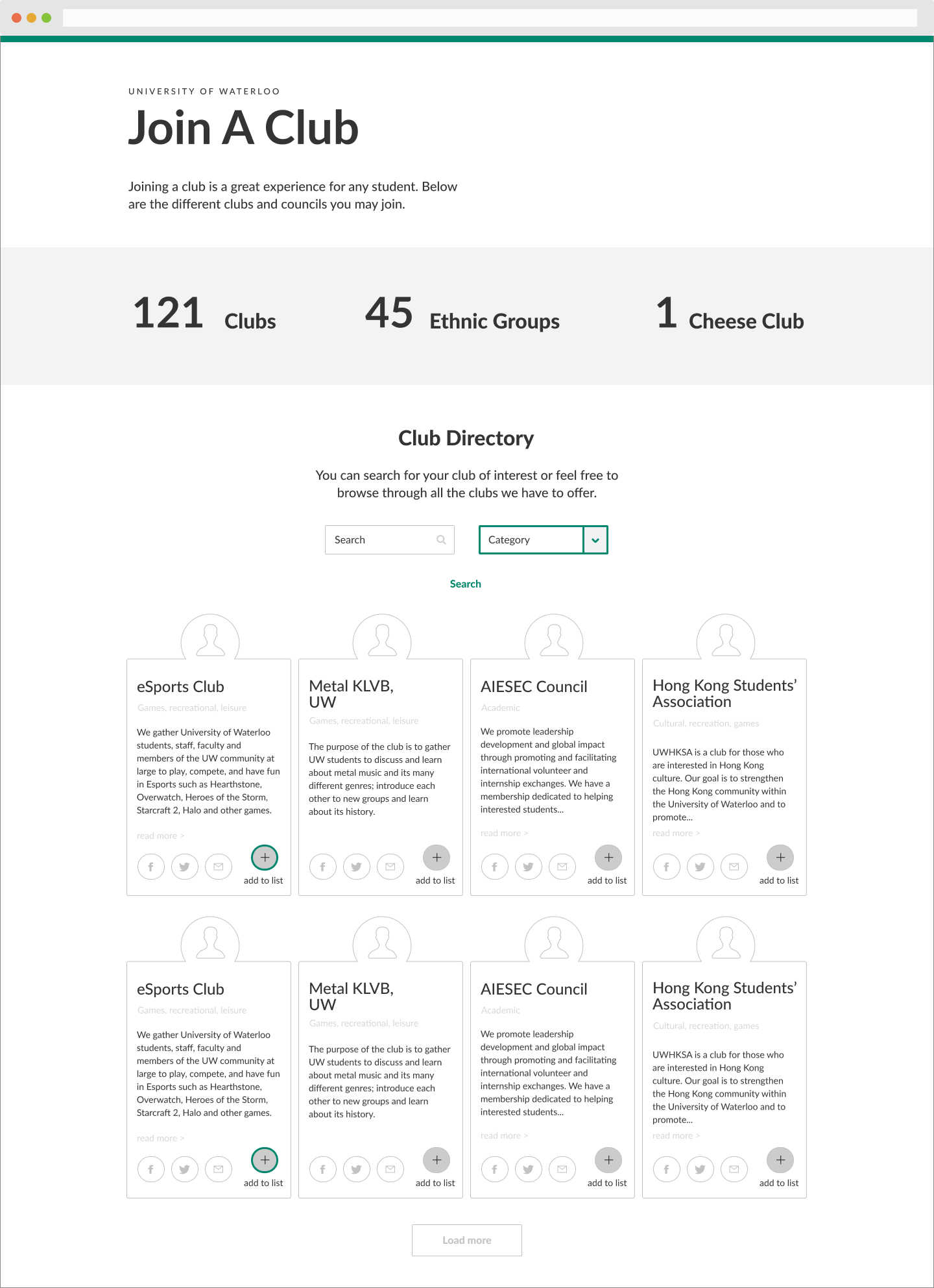
The club directory presents an immediate statistic about the current count of clubs, giving the student an impression about the immense selection the school has off-the-bat.
Each club profile, has a dedicated profile picture, alongside an add button that allows interested students to add their clubs to their short-list. Lastly, each club presentation is in a randomized order, diminishing the bias that comes from alphabetical order.
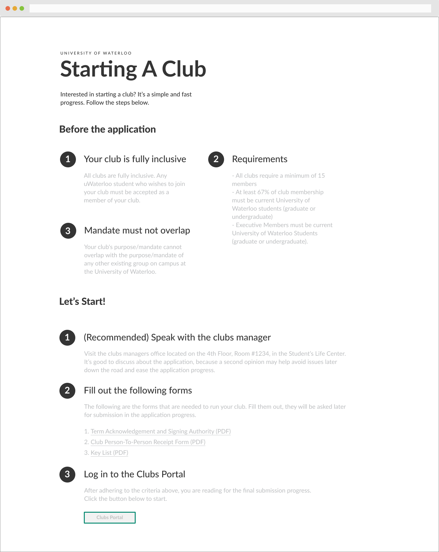
The starting of a club is streamlined for many users who don't know where to start. The step by step guide is structured in a format that prepares club leaders for the ethical criterias of starting a club, then streamlines them into the technical requirements of paperwork and form submissions.
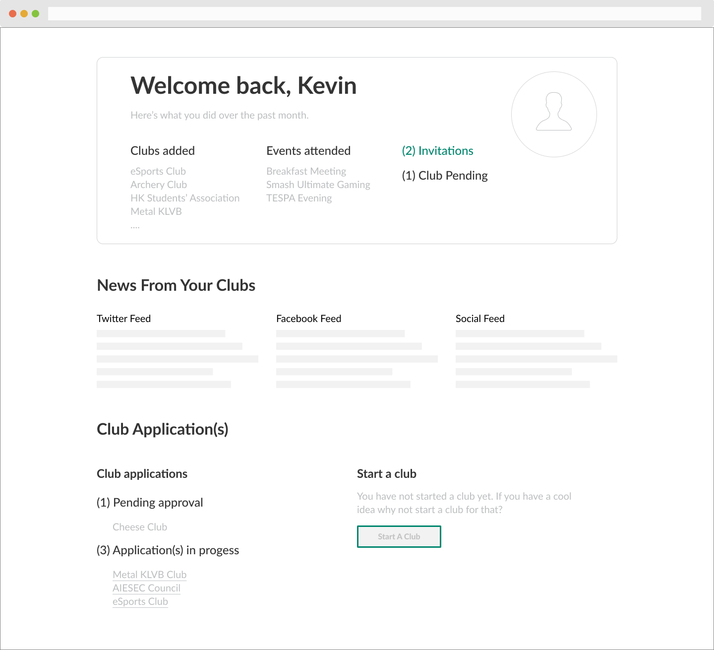
Having an account keeps all your clubs and councils organized in one place, without having you to organize meeting dates and event dates. It also manages club applications and gives other clubs the opportunity to review and reach out to potential candidates whom never have thought about the joining of the club.
This system has many opportunities for the school community to connect. It also gives students experience in reviewing potential members whom never have thought they would enjoy a particular club. It also guarantees club executives that their club members see a particular announcement, without out having to sacrifice their post viewings to other system algorithms.
For both the wireframes and high-fidelity designs, I followed a different variation of the Material Design system. I wanted my low-level design system to focus on strong typography, compared to a visual strong design system like Atlassian's.
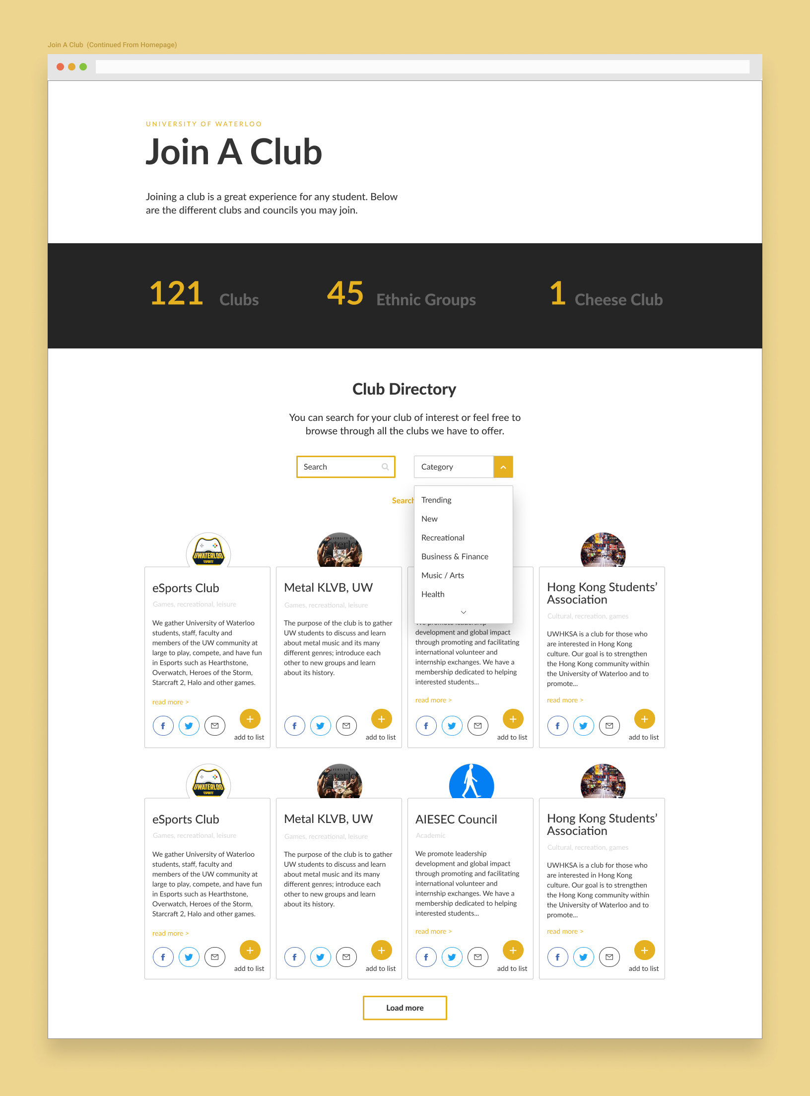
The colour scheme was based off of my school's colour pattern. The yellow was used to emphasize the more important areas that students should focus their mouse/touch interactions with.
The critical interaction point on the homepage, depended on the two buttons. I used yellow to emphasize that the club directory is what most people tend to click on. I used a rare green for starting a club, since most people understand there is a process for that particular button.
.png)
Each club has their autonomy to personalize their block on the club directory page. Also, the dropdown menu is categorized with the typical avenues of interests, but instead of only keeping it to that, I used parameters such as "Trending" and "New".
These two parameters work in two ways;
The club profile will mostly allow students to view their club applications and club events. For those who haven't started a club, there will be an option for starting a club that can be toggled on or off in the settings. The reason for this design is to encourage students to start clubs/councils.
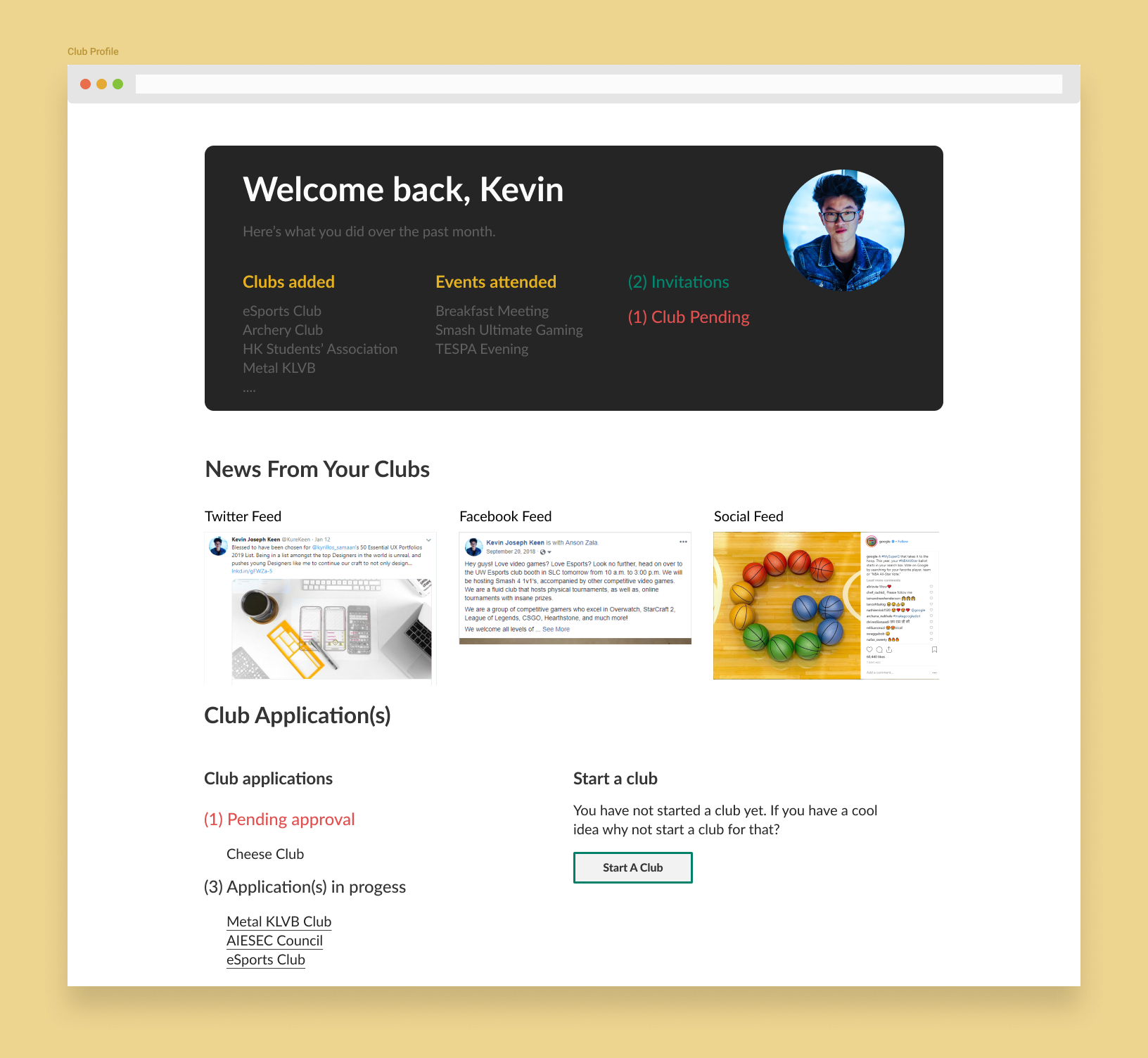
There is so much opportunities to expand the capabilities of the club profile page, such as integrating google calendars to sync dates, centralize all club administrative activities, and allow club executives to manage their clubs better. I would continue to explore more ways to better the club profiles page, if given more time, and think of other ways to connect the physical experience of attending clubs/councils to the digital experience.
I always love a good Design Exercise. While keeping an optimistic view, this exercise was very relatable. Clubs are a great way for students to escape the stressful life of exams, tests, quizzes, and everything in between academia. They also give students an opportunity to spend time with friends and do activities they find interesting such as this Design Exercise.
Thank You Googlers!