I was the in-house Graphic Designer responsible for rebranding Lay-Up. Learned more about the non-profit sector, and Design in the sports industry.
Part-time
Led the company brand redesign working alongside Quiet as Kept. Designed two annual summer reports for public donors and partners. Created partnership material for Nike, Mackhouse, and Serge Ibaka Foundation.
Sept 2019 - Aug 2020 (1yr)
Graphic design, communication, art direction, printing, visual design
After my internship was done, they brought me on board with a part-time contract, since I was still in school. I worked on numerous graphic design projects, I chose projects to display on my portfolio that taught me new techniques and showed my strengths in graphic design.
Lay-Up had hired a small design firm to create the static logo. After the logo was created, it was my job to make it come to life. I formatted the logo to be used on other platforms and design new materials for the unveiling of the overhaul.
I used the original Illustrator file and imported it into After Effects. After the edit was finished, the animation was used as the main promotion of the rebrand.

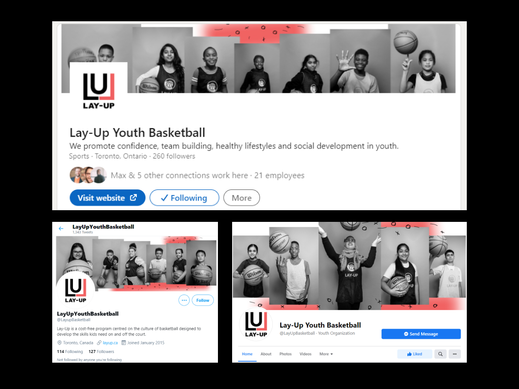
A new style of the banners for the Facebook, Twitter, and LinkedIn social pages. Featured participants from across the programs (signed consent to appear on digital media platforms). Increased followers growth on all social platforms, in total, an increase of 20% growth of followers.
Lay-Up hosted their first Virtual Summer 2020 program for participants across the GTA. Over 15+ coaches tasked with training and teaching live basketball skills over a stream. The team also brought on different people from other industries to teach our participants about careers they can pursue.
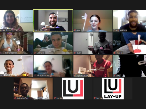
Learning how to make a mini-basketball net
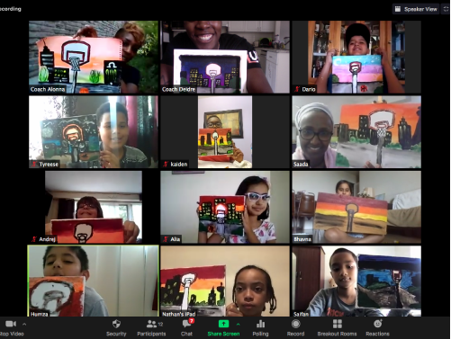
Paint sessions with Saada
I collected streams from zoom calls and created small showcase videos every week for social media to see. At the end of the program, I made a summer-end video to recap everything the participants learned and experienced.
At the end of the program, I designed an 18-page report outlining the team's accomplishments, participant statistics, and an overall view of how the virtual summer program turned out. There were two versions of the report, one with financial details, and one without, I decided to share the one without the financial reports.
I was tasked with the design of the slide decks, and any other materials needed for meetings with the Nike representatives. I designed two slide decks for Lay-Up to use for Nike. I also designed a small financial visualization report, but I will not share that in my portfolio. After a couple of months, Nike partnered with Lay-Up to provide merchandise for Lay-Up's coaches and participants.
I led the marketing campaign for the partnership between Lay-Up and Mack House. Lay-Up ran a shoe design competition within its community, and using the submissions, I created an Instagram post. The post includes a fusion of what Mack House does (self-service sneaker customization studio) with our participants' shoe design submissions.
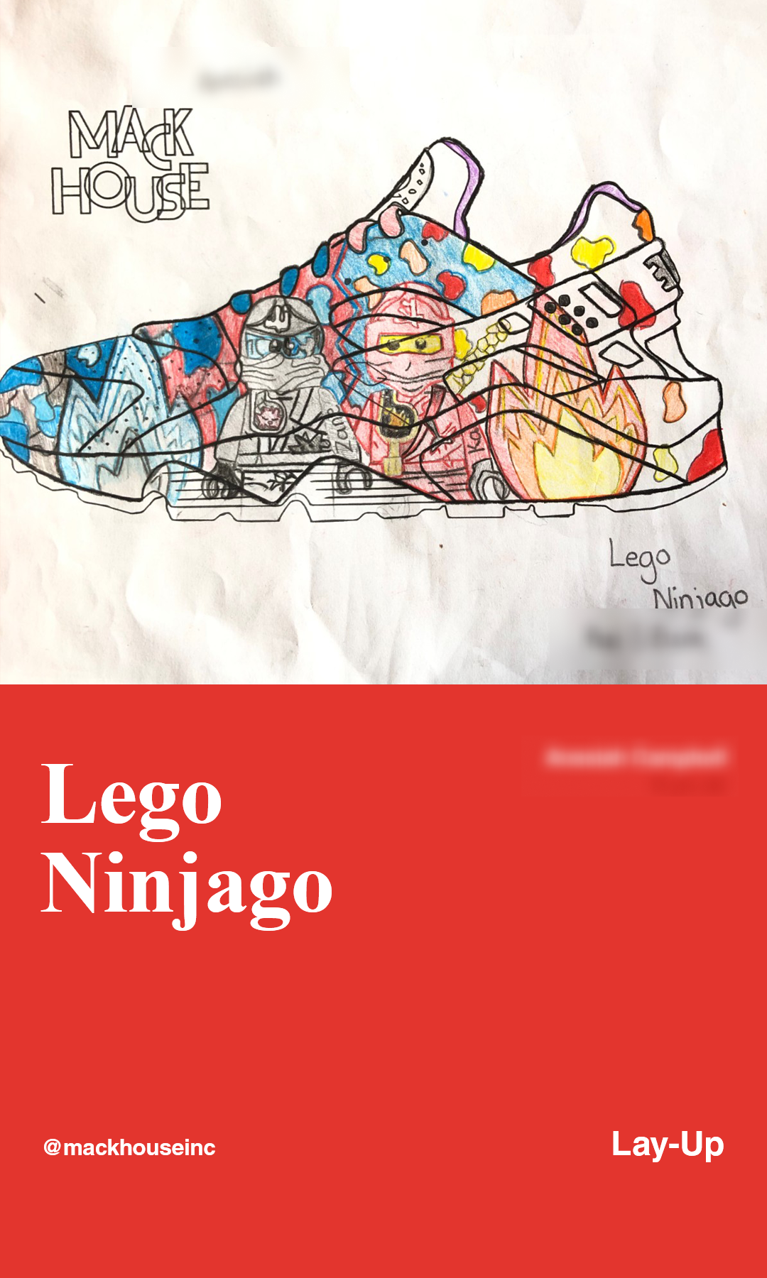
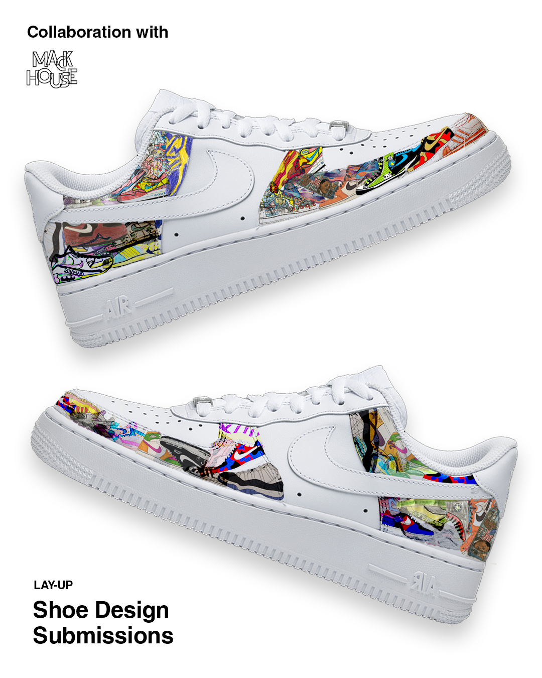
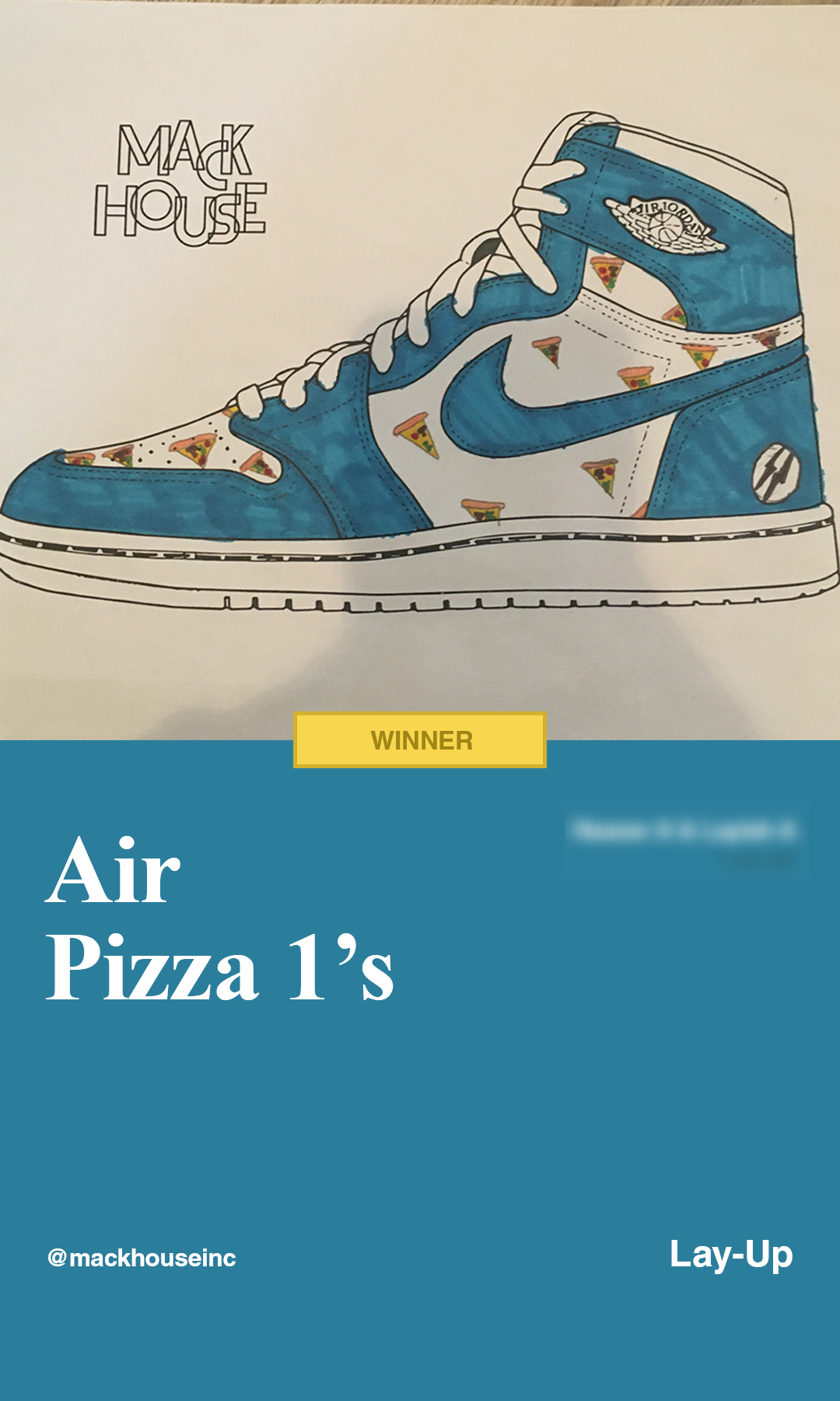
Just some of my favourite shoe designs
My last major project when I was an Intern for Lay-Up was creating Lay-Up themed sports cards for donors/partners. I designed 40+ unique sports cards, which were included with a Lay-Up exclusive mini-leather basketball. I also designed a small pin print-back layout for smaller donors.
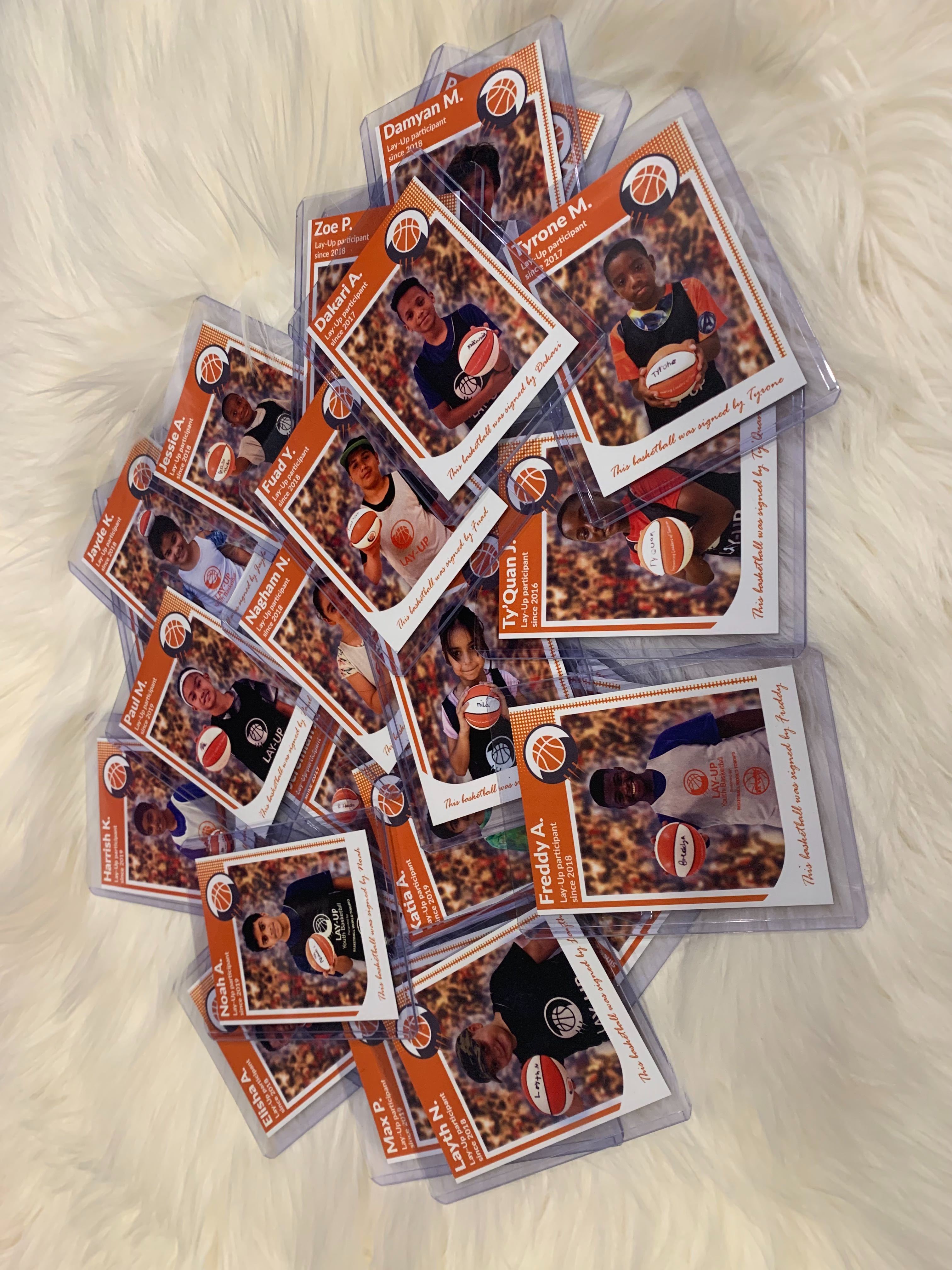
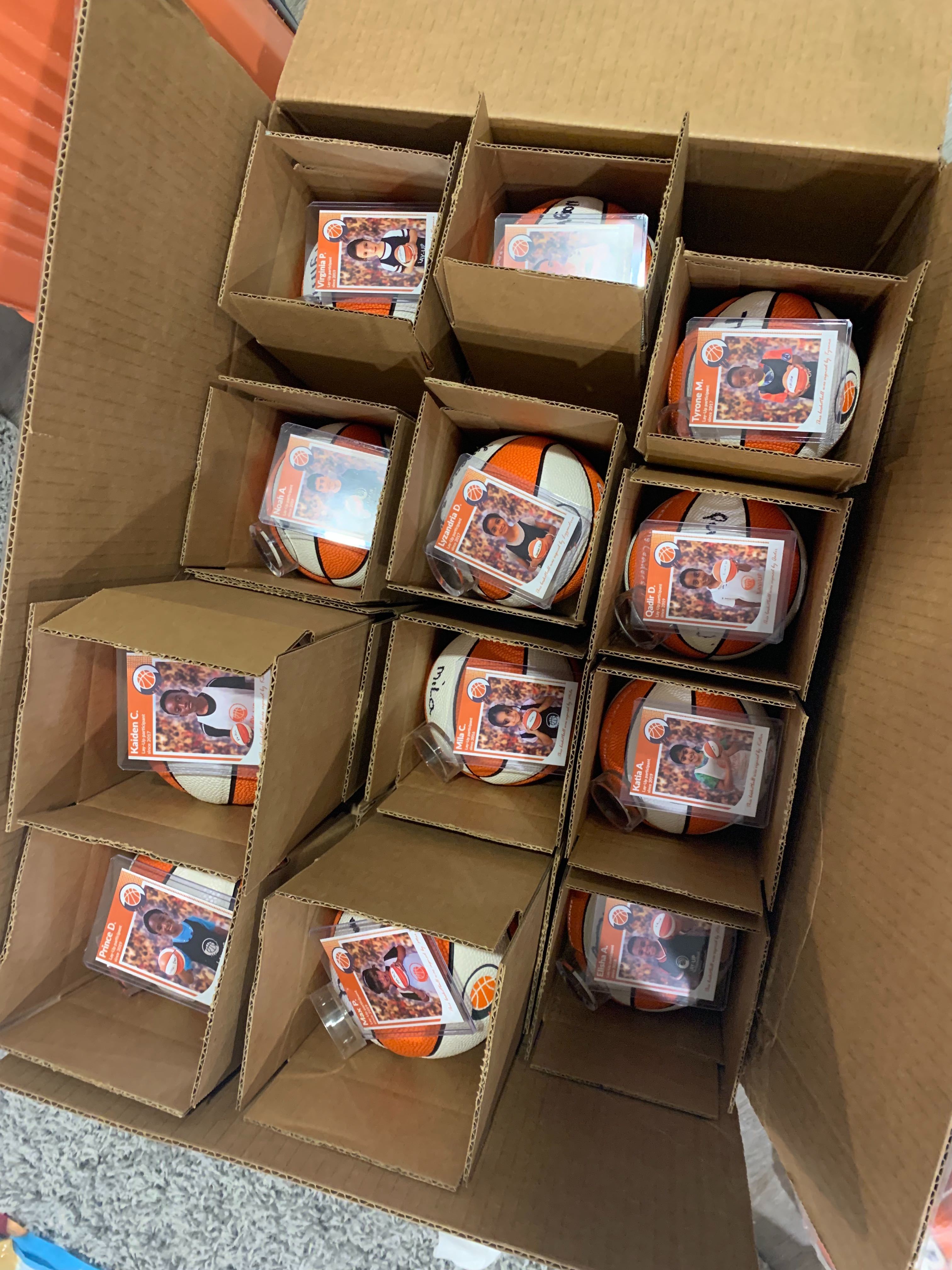
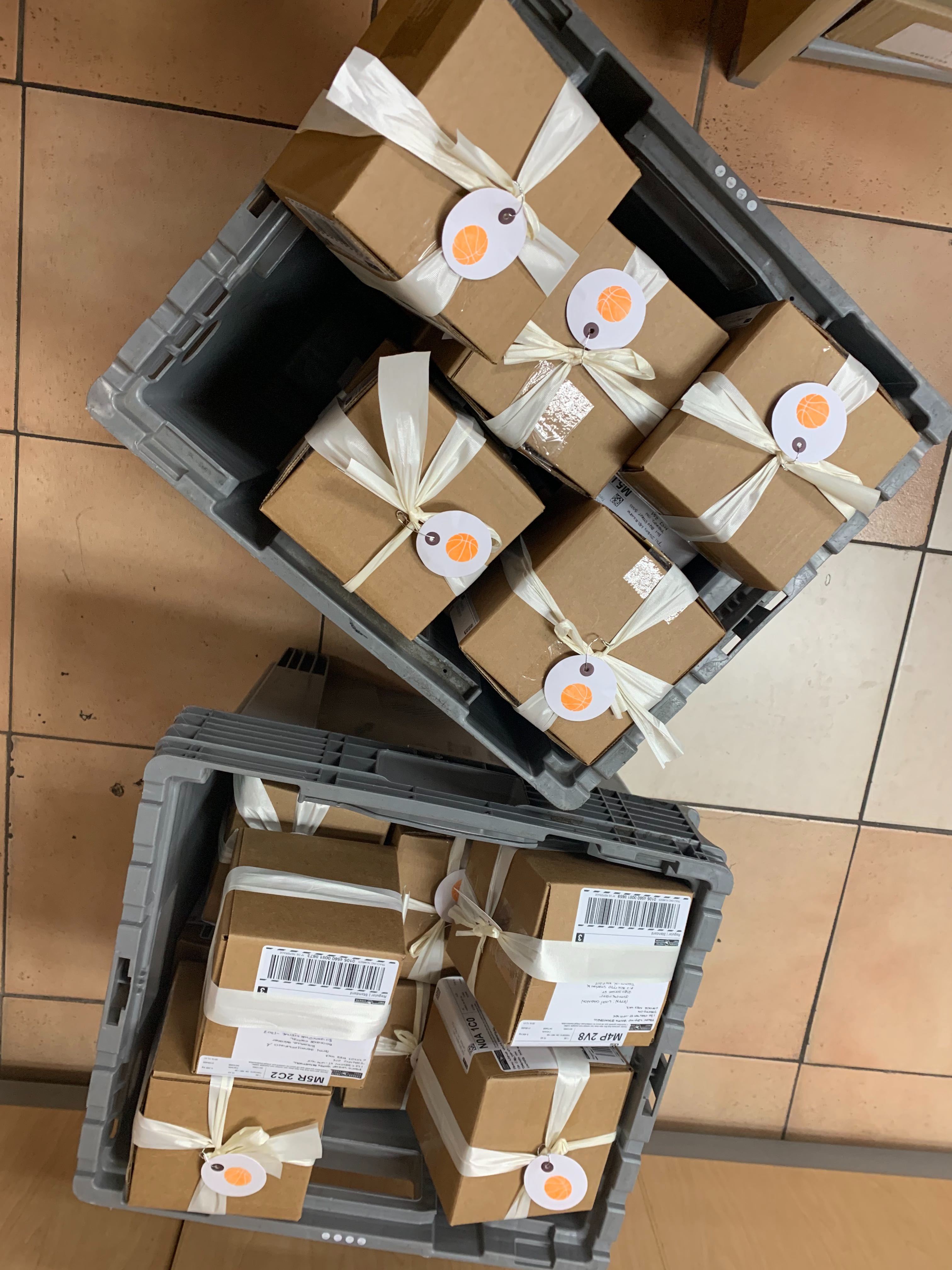
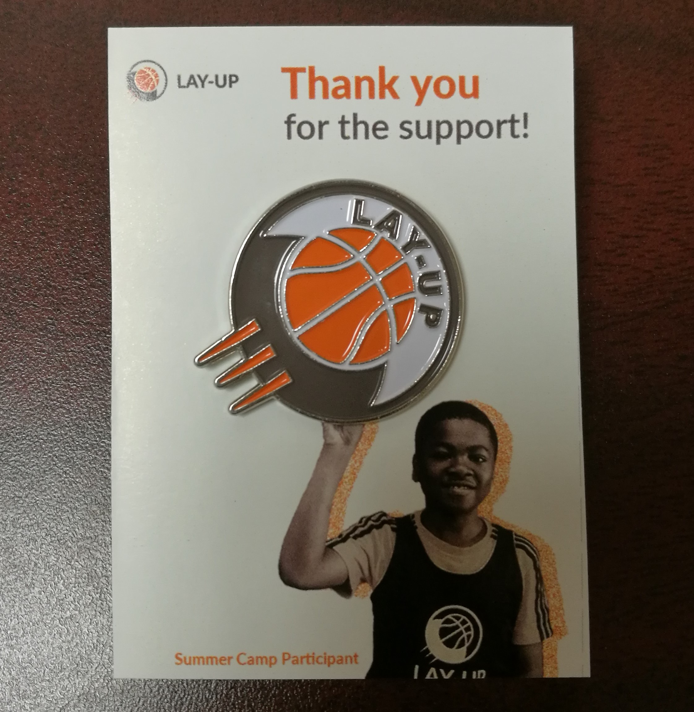
The logo shown was pre-brand redesign, also it was Delivery Day!
You May Also Like