
1 Product Designer, 3 Developers, 1 Product Manager, and 1 QA Analyst
1.7 Years (2023 - 2024)
Web (> 768px)
UX, UI, UXR, and Design System
Valeyo, a division of Constellation Software, brings over 20 years of Canadian lending technology expertise, supporting more than 100 clients and industry partners with innovative solutions in lending, insurance, and reporting software.
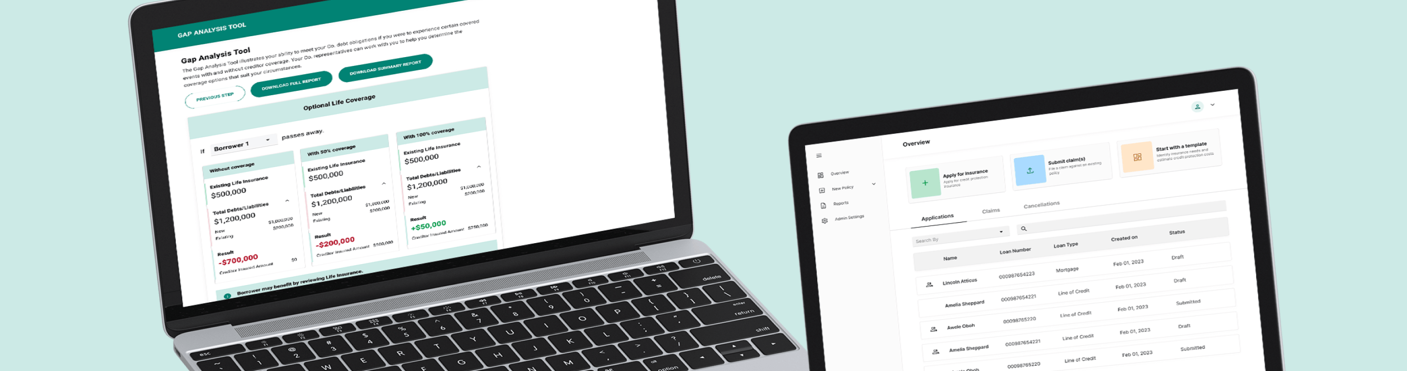
Valeyo sought to modernize its legacy products by transitioning to a digital-first platform. The outdated UX/UI of the legacy systems hindered lenders from completing loans and applications entirely online, requiring offline tasks. I contributed to the design of two new products: Ori, a loan origination software, and Nova, an insurance application software.

Identify current UX/UI issues, understand development constraints, optimize userflow through research and best practices.

Increase the amount of loan applications and insurance applications that includes premiums.

Reduce the time it takes to fill out both loan and insurance applications.
After working with the immediate team, as well as our industry partner, we pinpointed the reason behind low application completion rates. We developed a plan that puts prioritizing the UX and UI of the app, quick information consumption, intuitive navigation, and simplified results of the application.
Increase in Gap-Analysis assessments being completed.
Released to 300+ banks and credit unions in the first week.
Reduction in time to fill out a Gap Analysis assessment.
Valeyos low application completion rates indicated friction points in the user journey.
Multiple inputs to fill out application/assessments, some pages users had to input more than 12 inputs before moving on the next step.
An outdated PDF output that had multiple page defects, some calculation bugs, and only had one option which was always a simplified version.
Users found it difficult to understand the results of the gap analysis, which led many users not realizing how beneficial the gap analysis was for qualifying for insurance and/or a loan.
To fully understand the reason behind the low application/assessments completion rates, myself and the Business Analysts conducted competitor offerings, partner interviews, and reviewed the current analytics for the Gap Analysis.
Conducted a competitive analysis on leading gap analysis assessments.

Interviewed multiple senior partners who have years of experience within the insurance and lending space on a sprint-sprint basis.

Reviewed the data with the team to track application #’s, time to complete, and drop off areas.

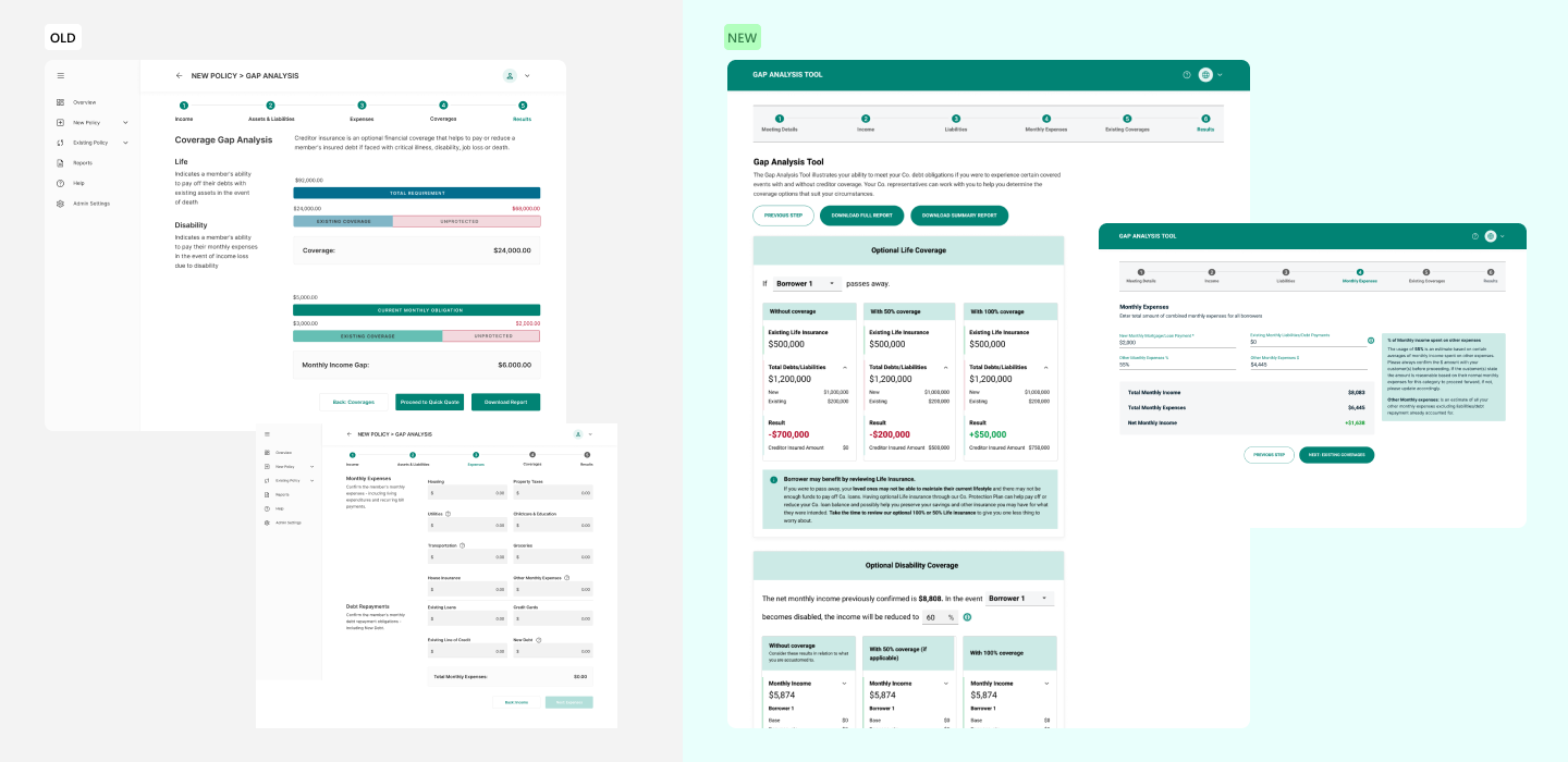
After the initial research was finished, I began to map out the current userflow of the Gap Analysis. Once the flow was mapped out, I could begin to leverage the above analysis to prioritize the new design which would focus on improving the speed of filling out an assessment, provide clear understanding of the content hierarchy, and introduce newly designed features to the application.
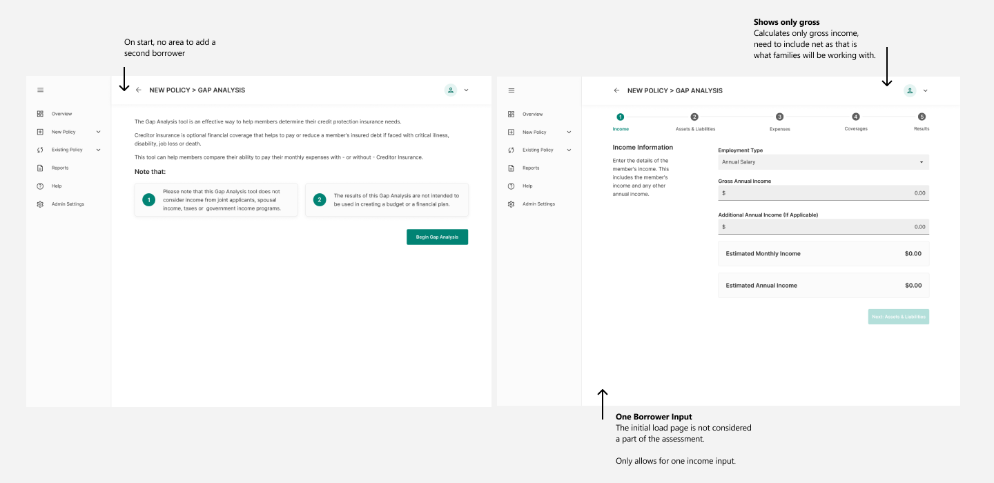
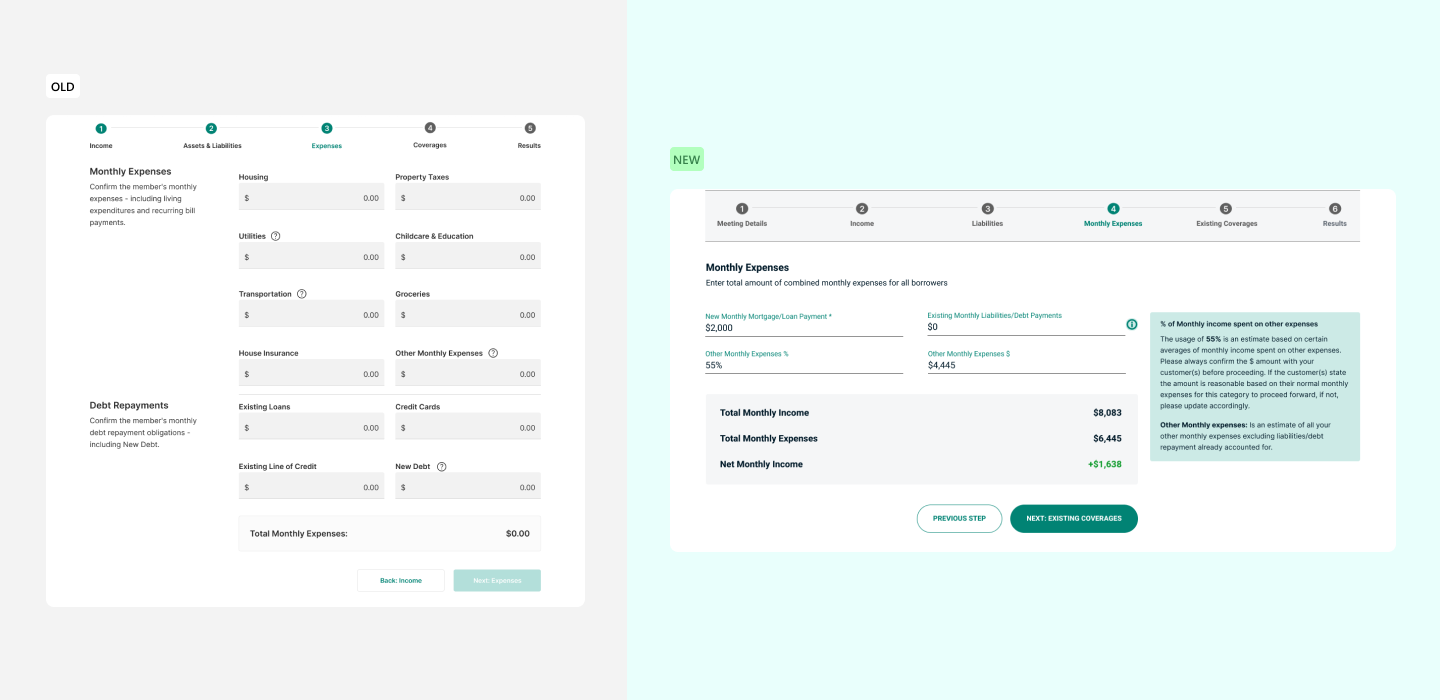
The design also did not account for net income and the first step (the initial assessment load) was not considered part of the step. Users could not navigate back the page they started from.
After the research, we also learned that users would combine their incomes into one since the design did not support dual users. This led to many incorrect calculations and misled users.
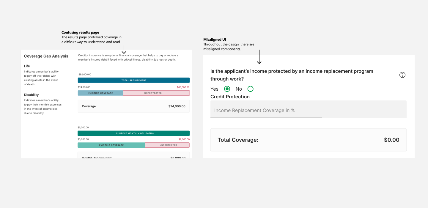
Misaligned UI throughout the application step such as uneven padding/margins and titles not within the same rows as their respected content. Users said that when content that is shown through visuals, it was difficult to understand the calculations through the visual design.
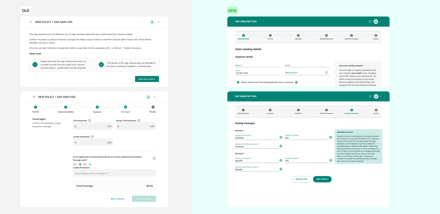
Allow user to configure dual borrowers before the initial load of the analysis. Throughout the analysis, make it clear and fast for users to input info for other borrowers.
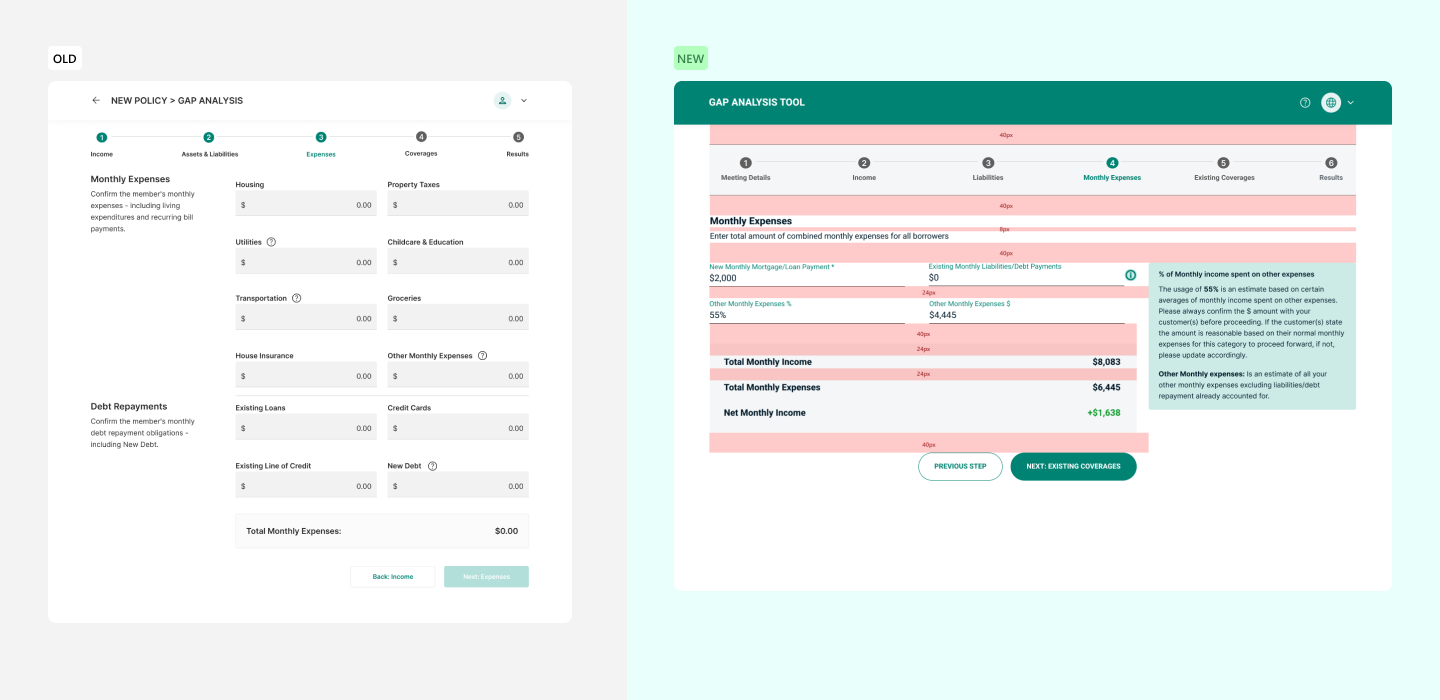
Created a rigid UI spacing procedure, depending on content, component, title, sub-title, etc. This also helped developers better organize the front-end codebase.
All the UI misalignments were fixed. Expedited development by reducing story point allocations by .2.
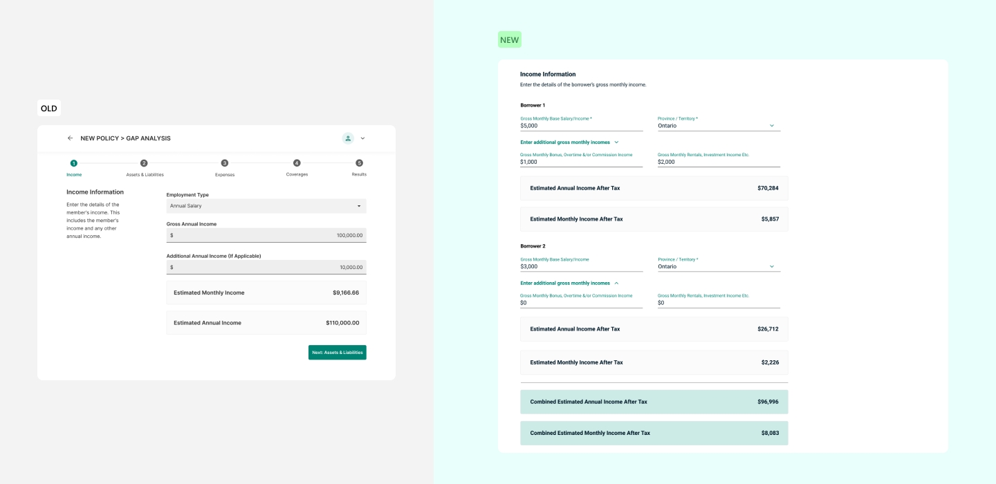
Implemented tax bands for each province/territory to get more accurate calculations and a realistic analysis.
Categorized income intro three distinct categories (salary, bonuses, and rental/investments) since other income may not get taxed such as rental income.
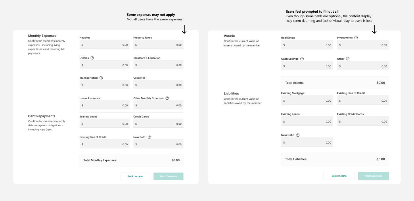
During our partner interviews they told us that their users much prefer a quicker way to input their income, expenses, and assets/liabilities owned instead of having a very detailed drilldown of their finances. The gap analysis is their initial step into seeing if they can take on a loan/mortgage, this tool would often be overlooked as users found no benefit in integrating this tool into their insurance qualifications.
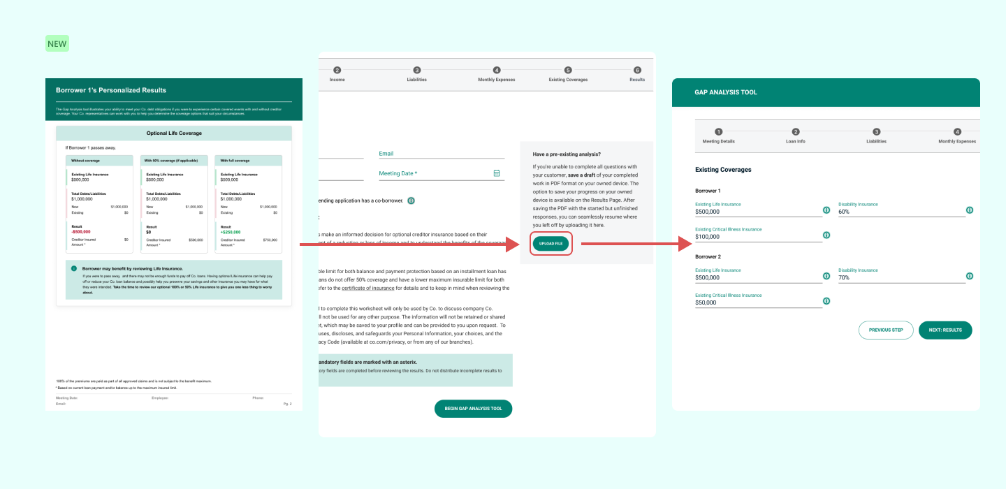
At any point in the analysis, users can skip to the last page, download a current view of the analysis. Once they want to resume using the tool, they can upload the PDF they downloaded and it will pre-fill all the fields.
Allowed users to save time, and not feel pressured that they have to complete the analysis in one sitting. This allowed users to feel comfortable with the entire analysis process.
Reduced 27 field inputs for a single borrower to 13 fields inputs (more than 50%), and if you include the lender information at the first step, it would be 17 fields. Even when there are two borrowers, it equates to 20 fields which is still a lower amount than the previous design.
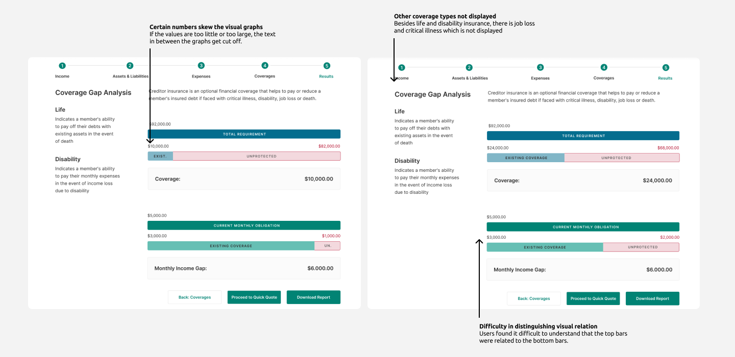
On top of visual errors, and hard to understand visual design, the “Coverage” and “Monthly Income Gap” was referred more than the visuals. However both didn’t really tell the user whether or not they could afford a loan. The results page didn’t “sell” the user on what type of insurances they should proceed with nor did it ever introduce types of insurances.
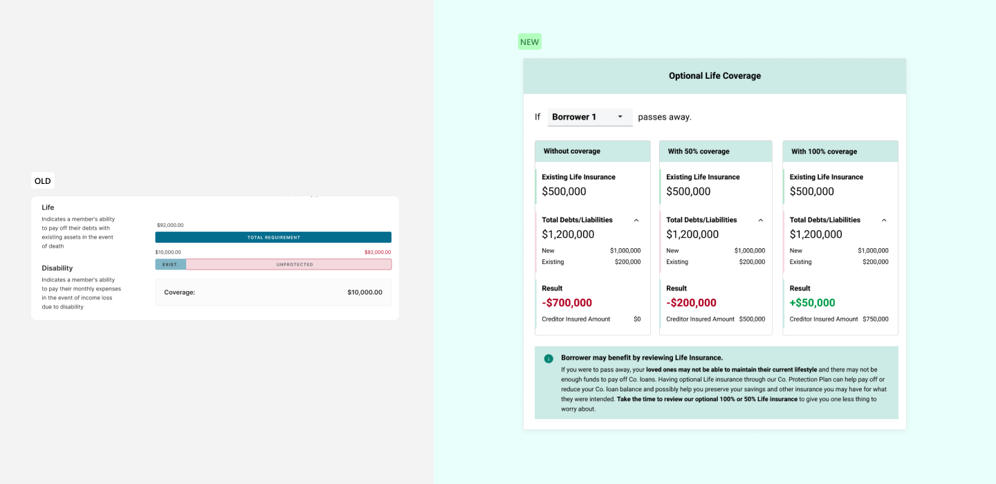
Added a detailed breakdown of each insurance coverage, that reflected the users financial statements. As well as a detailed breakdown of the users current financial standings.
Showed the difference between different insurance coverage values and allowed for users to switch between views for their respected borrower to see each borrower in the example scenarios.
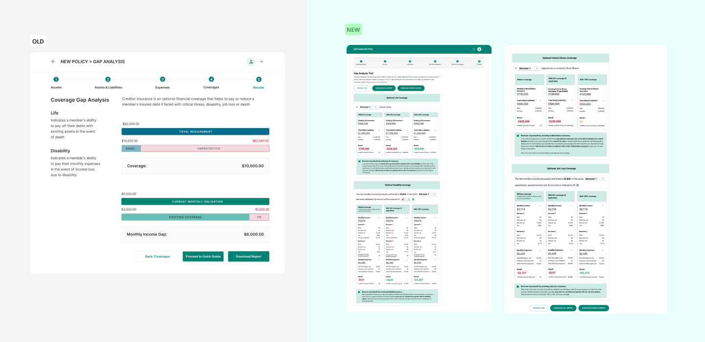
Included all 4 available coverage types and placed CTA’s at the top and bottom depending on lender usage.
The gap analysis output is a PDF in two versions: detailed version with a breakdown of all borrowers, and a simplified version. Take a look at the detailed version for one borrower below.
01
Lending and Insurance Technology
This was my first time learning about the technology behind the lending process as well as the insurance process. Surrounded by very smart colleagues whom have years of experience in these fields, I was able to learn quick. I was able to make actionable design choices based off of what they taught me, and fused that with my current knowledge of best UX practices. The capability of lending technology and insurance technology has so much room to grow and the opportunity to innovate is there for the taking.
02
Some answers can only be answered after launch
As UX/Product Designers we try to minimize user frustration through-out the product. However, some cases we can not “assume” that a design is good, especially if it has never been done before. We need to ship the design feature to see user impression and with that we can make the best judgement towards a design.
03
Adapting to different team dynamics
My time at Constellation Software - Valeyo, I had the privilege to work with 3 different product teams. The teams were Insurance, Lending, and Banking. Each team had a different style of working, how they measure workload, how they release product updates, who calls the shots, different roadblocks, and of course the different products they work on. I quickly booked 1on1 meetings with the leads on each team (Product, and Development), then I reached out to individuals on the team that I would be working with more closely such as the Intermediate Developer or Senior Analysts.
You May Also Like